For the story What ‘Women’s Work’ Looks Like Now, Soo Oh and I explored Labor Department data to show the changes (or lack thereof) in the workforce.
The lead visual was this dataviz. I had a lot of fun designing it and wanted to document my process.
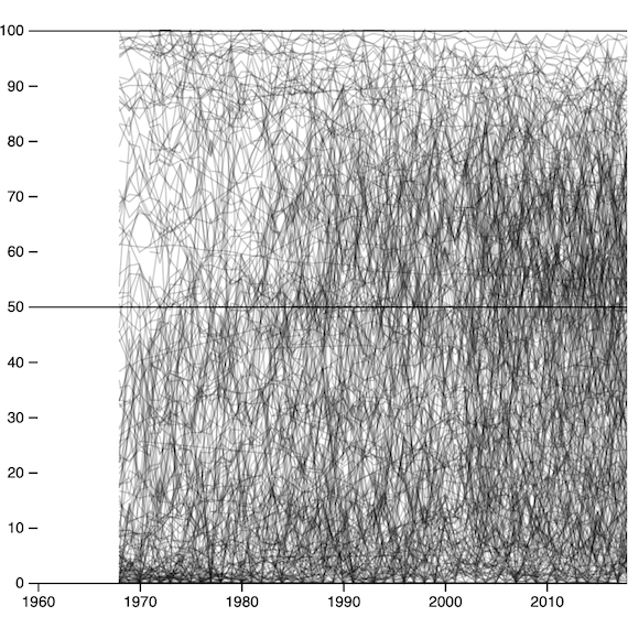
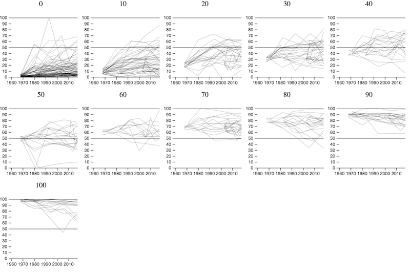
Early on in the process, I set out to design a graphic that summarised the trends in a single, eye-catching design. Plotting all 329 occupations as a fever chart was an unreadable mess.
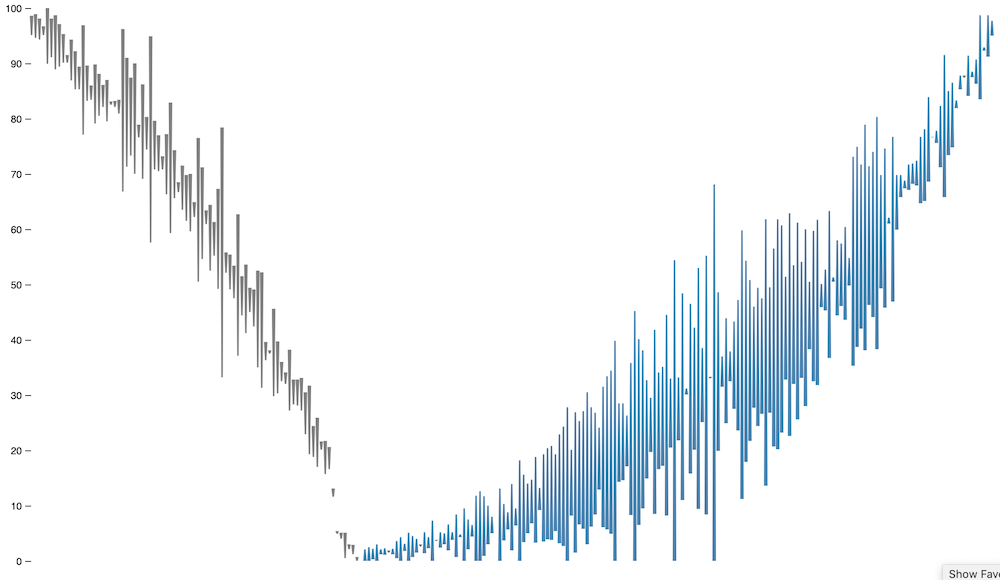
I started in Observable, exploring a ‘floating bars’ idea to show the change from 1970 through to 2018. Although pretty, it didn’t seem to tell the reader much.
At that point, I went back to paper and sketched out some ideas — keeping in mind that I couldn’t be sure of the final shape of the data.
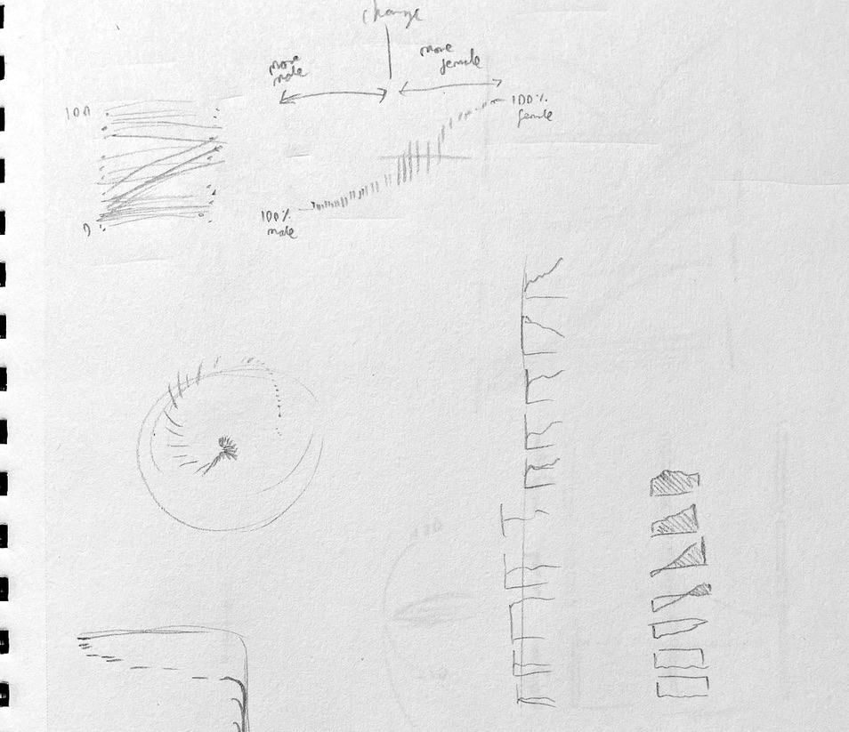
It occurred to me there were multiple trends worth calling out: occupations where women had become the majority, where the reverse was true, and where the ratio between men and women had stayed static; and more broadly the shift towards a more integrated workforce. I wanted to check the size of these groups to inform my pencil sketches. Switching back to d3, I started collecting the messy lines into buckets.
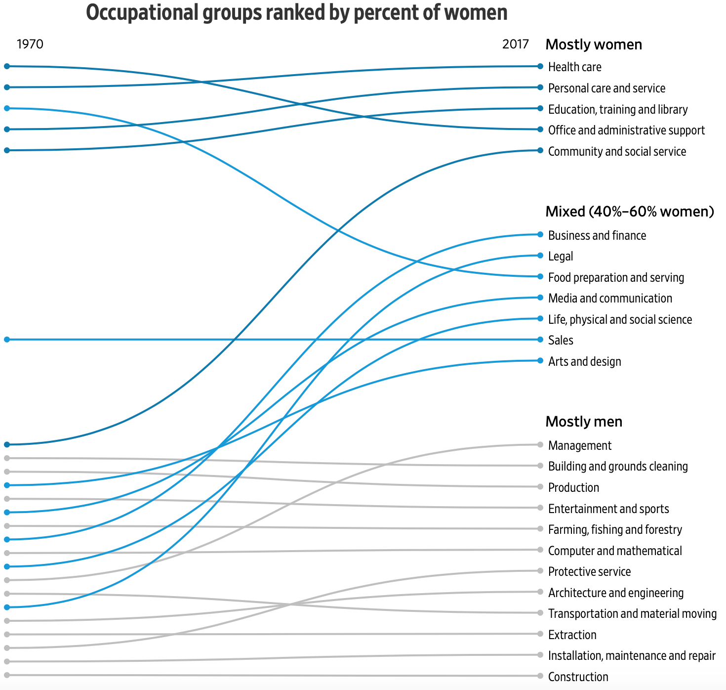
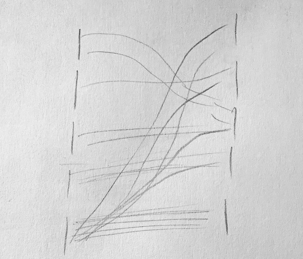
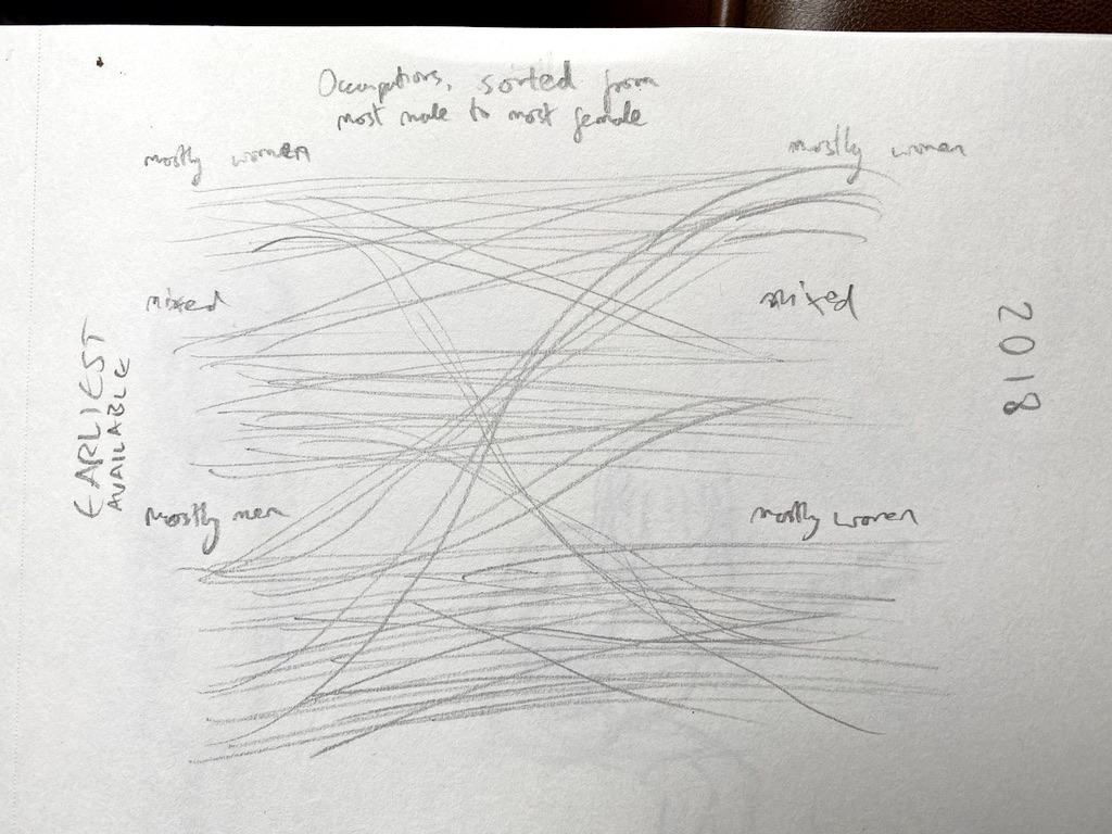
Getting closer, but not very pretty. I switched to paper again and stumbled on the idea of a ranked, grouped slope chart.
I then tried to recreate the design with actual data. The code for this is a mess, but it works! My original thought was it could be super tall to incorporate as many labels as possible.
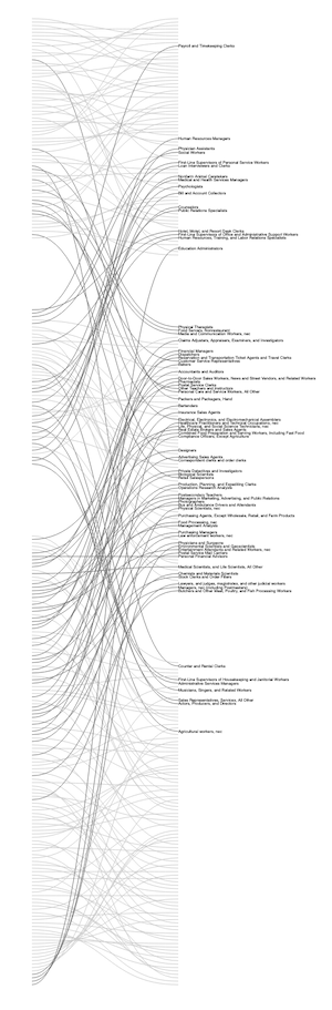
Ultimately, Soo and I decided to chart only the high-level occupation groups due to sizeable gaps in the data. Luckily the chart design was flexible enough to accommodate that.
The full piece goes into a lot more detail and includes a lookup tool.
Published .