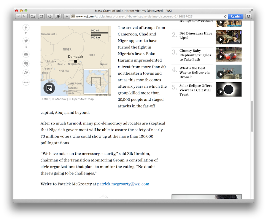
For the past couple of months I’ve been working on Pinpoint, a new digital mapping tool for The Wall Street Journal. I felt like a proud parent on Friday as it was used online for the first time (even if the story itself was rather less uplifting).
Behind that relatively straightforward map is my largest project since the World War I feature, so I wanted to provide an inside look at how and why we changed our approach to digital locator maps at the WSJ.
The Journal has had an internal Google Maps-based template since before I joined, but the template had a number of issues: it wasn’t in line with WSJ’s map style guide; it had a fiddly editor tool which required leaving the page to get marker coordinates or preview the final output; and worst of all, it allowed users to add popups with embedded video and audio — resulting in a few graphics which definitely did not need to be maps.
The straw that broke the camel’s back, however, was its fixed width as the main WSJ site began to transition over to a new responsive design. Rather than just give it a width of 100%, we took the opportunity to rethink our approach to digital locator maps altogether.
The Journal is lucky to have two full-time cartographers on the graphics team, Renee Rigdon and Brett Taylor, who produce beautiful custom maps using ArcGIS. Yet demand for maps within the WSJ is so high that having a simple digital map creation tool is still necessary, especially for bureaus in different time zones.
When it came to designing this new tool, Brett and Renee were involved from the very first planning meeting, helping decide what it should do — and more importantly, what it shouldn’t. We quickly agreed that this template should be specifically for locating things, rather than a glorified media gallery, so popovers were definitely out of the question.
The result of this collaboration is ‘Pinpoint’, which is a flexible JSON-powered template and, separately, a user-friendly map creation interface.
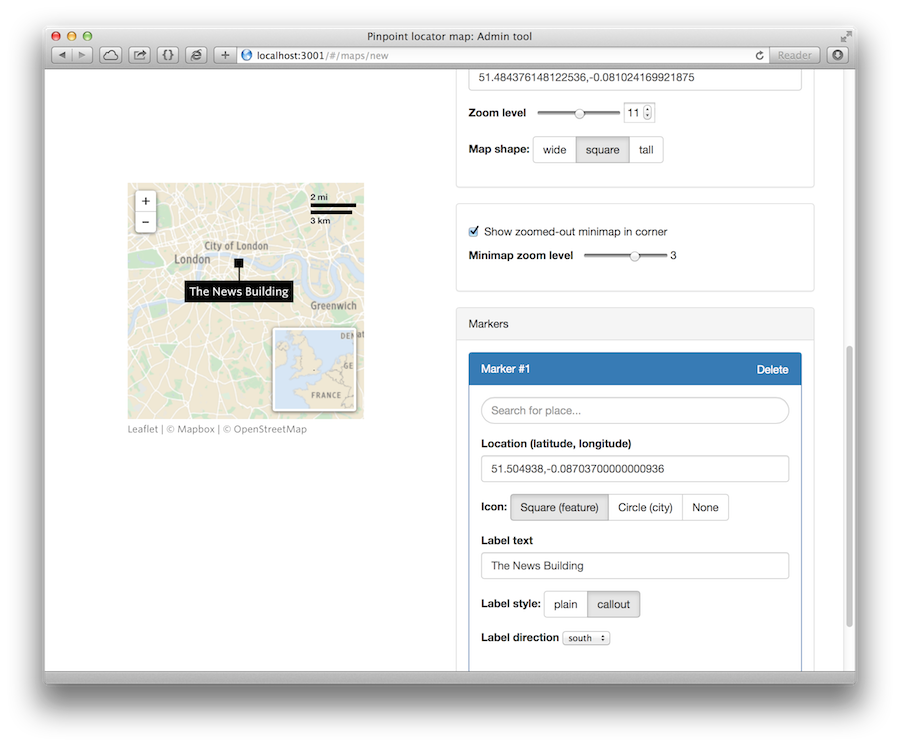
The internal Pinpoint editor tool.
The most important aspect of Pinpoint is one that readers will never have to see: the map-building interface. This editor tool was written using Angular (it was my first ever project using the framework, in fact) and makes use of the Google Maps API to search for locations.
I tried to reduce the number of options to a bare minimum, both to prevent feature creep and to not overwhelm users with a hundred form elements. Instead I focused on useful UX features, such as the ability to frame the map simply by dragging and zooming, drag-n-drop markers, and — following a round of guerilla UX testing — a ‘quickstart’ panel to center the map and add an initial marker. As a result, editors can put together a basic map in under a minute with zero training1.
The frontend is significantly less complex: a Leaflet map with custom-designed markers and the MiniMap plugin rolled up into a simple JavaScript library (the library is also used in the editor tool to provide an accurate live preview).
I’ve written about the mobile map problem before, but in this case, scrolljacking — when embedded maps steal the scroll focus, preventing the user from getting past it — was my main concern.2 To alleviate this, I added a simple ‘click-to-activate’ feature using a transparent div over the top. (Built-in Leaflet deactivation features didn’t cut it.) Pinpoint also automatically calculates a boundary around the map to prevent readers from accidentally panning miles away.
Aside from getting to grips with Angular, my greatest takeaway from this project is a newfound appreciation of the complexity of cartography. After all, Pinpoint maps still look rubbish compared to Brett and Renee’s incredible hand-crafted maps, even the smaller ones. Judging by the current standard of JavaScript-based mapping technology, I certainly don’t see any piece of software replicating their incredible work any time soon.
Footnotes
-
Of course, it’s still possible to make bad or irrelevant maps with Pinpoint: the most important part of our internal documentation explains what makes a good map and when they are appropriate to a story. ↩
-
See this unfortunate example which instructs mobile readers to “swipe to the right of the map to scroll past it”. ↩
Published .