A large part of my job at the Wall Street Journal is producing “news apps”, small JavaScript-based programmes, often interactive infographics. They may be designed to supplement a written news story, or sometimes stand alone.
A few examples: Europe Without Flights: A Paper Timetable Adventure, The London Taxi Challenge and the mega-sized WWI legacies project.
I thought it might be interesting to write up some notes on my current development process. Please bear in mind that this is merely a snapshot of my current workflow, and is constantly evolving. I’m more than open to any suggestions or criticisms.
Rapid prototyping
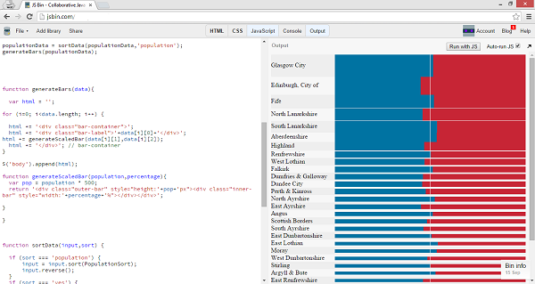
Once we have a basic idea for an interactive mapped out — sketched on paper, in Illustrator or perhaps just verbally — I’ll begin developing a very basic prototype. Typically I’ll start by loading up JS Bin and focus on working out the most technically complex components.
Later on I’ll switch to a local HTML file, and even later to the standard WSJ template. I may do some serious cleaning up of the code, but I’ll rarely throw away prototype code altogether.

Here’s an early prototype of the Scottish referendum results graphic with dummy data.
JavaScript coding style
To keep things neat and avoid using the global namespace, I will usually wrap every function (and key variables) into a single object. I’ve yet to be convinced of the usefulness of client-side package managers such as require.js and Bower, but I’m happy to have my mind changed.
I use jQuery and Modernizr in every project, and when necessary D3 or Leaflet (more on these below). Handlebars, a dynamic templating library, can be useful on larger projects.
CSS
I have few personal rules when writing CSS: selectors must be classes and are written in “spinal-case” (lowercase with dashes). For larger interactives SASS (well, SCSS) can be helpful, although I have a bad habit of over-nesting my selectors.
So far, I haven’t found a CSS framework that does anything but get in my way; but with Bootstrap being integrated into the latest WSJ graphics template, that may change soon.
Data formatting
Having data in a separate CSV or JSON file - separating the ‘model’ from the ‘view’, to use programmer jargon - is common practice, but I find that even at runtime it’s important to keep data centralised in a single location. In future, I’d like to experiment with more object-oriented structures and turning every data ‘row’ into an object with helper functions.
I use Shan Carter’s excellent Mr Data Converter to quickly transform Excel-based documents into manipulatable data formats. For more dynamic or complicated datasets, I’ll often do some server-side processing to reduce the pressure on the client side. This is often the first thing I’ll do on a project, since establishing a clear data structure early on is crucial.
Mapping
CartoDB is a handy service for throwing together interactive maps based on simple datasets. However, getting my hands dirty with Leaflet.js (which CartoDB is built on) is essential for something more bespoke. D3.js - which can be used for a lot more than just maps - is a good option when in need of nice clean vector maps of countries and regions.
Mobile-first design
Producing media-rich interactives that work well on mobile is, I’ve found, far easier said than done. I’m still experimenting and refining my strategies. A key part of a mobile-first approach is to keep things as simple as possible; avoiding dense or complex layouts, sticky elements and (most crucial) a reliance on hover/click events.
Fundamentally, the mobile design must be taken into consideration from the start, dogmatically sticking to mobile screens for initial sketches and prototypes. In an ideal situation, there should never be a need for that dreaded question: “But how does it work on mobile?”
Scrolling list and card formats are easy mobile-friendly options (think mail apps, Twitter or the Facebook ‘stream’) but apps like Tinder and Facebook Paper prove that there can be alternative structures. The real challenge is to get them working in the treacherous environment of a mobile browser.

Postscript: Your thoughts
Fellow news app developers: Think my process has flaws, or feel like sharing your own workflow? Let me know on Twitter, or (even better) write a blog post of your own!
Published .