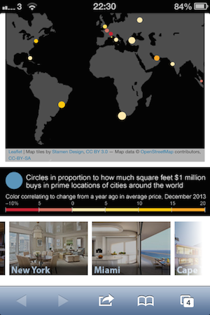
Integrating interactive maps in data visualisations is trivial nowadays thanks to projects like Leaflet.js, CartoDB and Google Maps. I used all three during my first month at The Wall Street Journal, mapping UK house prices by region, European investment in 4G, the Ukrainian region of Crimea and million-dollar properties.
Though each mapping service has its strengths and weaknesses, none feel truly satisfying on mobile without extra effort. The past few weeks have left me wondering if it may be worth designing alternative map interfaces for mobile users — or even going for for a different type of visualisation altogether.
What’s wrong with mobile maps?
In a nutshell: maps on a small touchscreen are not pleasant to interact with. This becomes especially true when maps (Google or otherwise) are embedded in websites, as their interference with normal scrolling is made worse by small screens.
The 2012 rebuild of Google Maps acknowledged this flaw by introducing an alternative control scheme. Now, in addition to poking at placemarks, the list of search results can be navigated with simple swipes left and right.

Much more efficient than stabbing at red dots. GIF source: Google.
Google’s designers had learnt that the ultimate UI for a mobile map isn’t necessarily the map itself. Though not immediately intuitive, the swiping panel solution a far more efficient method of navigation, removing the fiddliness of panning and tapping.
This worth keeping in mind when building map-based interactive visualisations. In ‘Million Dollar Rooms’, I added a row of large touch-friendly buttons below the map to guide mobile users to make up for the small targets on the main map.

With more time, I might have tried orientating the entire visualisation around this control scheme, and removed touch events from the map altogether on mobile. However, another option could have been to ask…
Do I really need a map?
Everyone loves a good map — they’re conceptually easy to understand, both for creators and readers, and an obvious choice for geographically distributed data. Sometimes, though, it’s worth stepping back and considering whether a map is the most ideal format.
A great example of this can be found in a recent article on Source in which Tasneem Raja explains how the Mother Jones visualisation team rejected a fussy, overcomplicated map of the US in favour of a less orthodox table-based layout. This approach may have had a weaker visual impact, but makes the data far easier to parse than a standard colour-coded map.
Surveying the landscape
As mobile traffic increases for publishers (including The WSJ), it’s important to provide these users with an experience equal to that of the desktop. Simply taking a map that works well on a large screen and squashing it onto a five-inch screen may not be enough.
Published .