A trend among larger publications these days is the “immersive” story, usually a long, media-rich scrolling narrative. With the Wall Street Journal’s WWI feature, a collection of 100 legacies of the First World War, we wanted to explore an alternative way to immerse readers in the subject.
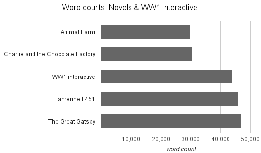
At 44,000 words, the WWI feature is far longer than the average “immersive”. In fact, it’s longer than some novels.

Word count sources: here and here, neither of which are necessarily reliable.
Despite its length, the feature has proved to be far “stickier” than the average article. Readers are on average reading for around 10 minutes at a time with a bounce rate of 30%.
So how did we make something so large without intimidating readers with a wall of text?
In contrast to the current trend of stitching together photos, text, video and interactives into a single narrative, the WWI feature is split into 100 discrete chunks.
This decision was made in part due to the subject matter. To write a coherent narrative out of WWI legacies that include chemical weapons, Baltic independence and cake in Japan would have been a challenge.
Instead, each is a concise 350 words, a prime position in the Quartz Curve. Each is rewarding alone, but for those readers that stick around, jumping between items is a painless, disruption-free reading experience.
We wrote a custom JavaScript app to route between pages, with some PHP behind to stream data and provide static pages for SEO purposes. This technique, frequently used by modern news sites like ReadWrite and Quartz (and for years by the likes of Facebook and Twitter) provides faster loading times, helping retain impatient users.
The takeaway from this? ‘Immersives’ should be built with cutting-edge tech. But they don’t necessarily need gimmicks like parallax scrolling in order to immerse readers.
Well, except for maybe those sorting animations. Couldn’t resist those.
Published .