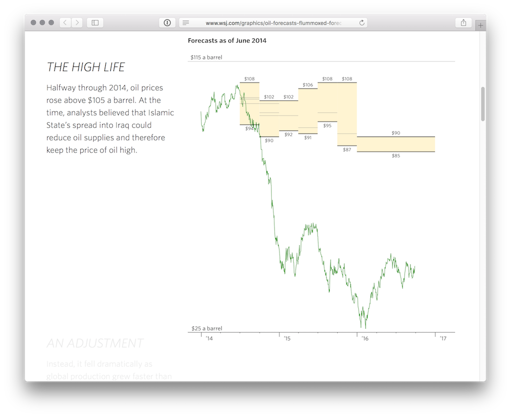
I recently published How Oil’s Fall Has Flummoxed Forecasters (requires a subscription to The Wall Street Journal), an interactive graphic that explores two-and-a-half years’ worth of forecasts of the price of oil. Before reaching the final design, I first crash-tested early designs on fellow graphics staffers, and later refined the design with the help of Maryanne Murray and other editors.
Please note that the data presented in the following sketches are incomplete and, in places, inaccurate. They are presented here only to illustrate the design process.
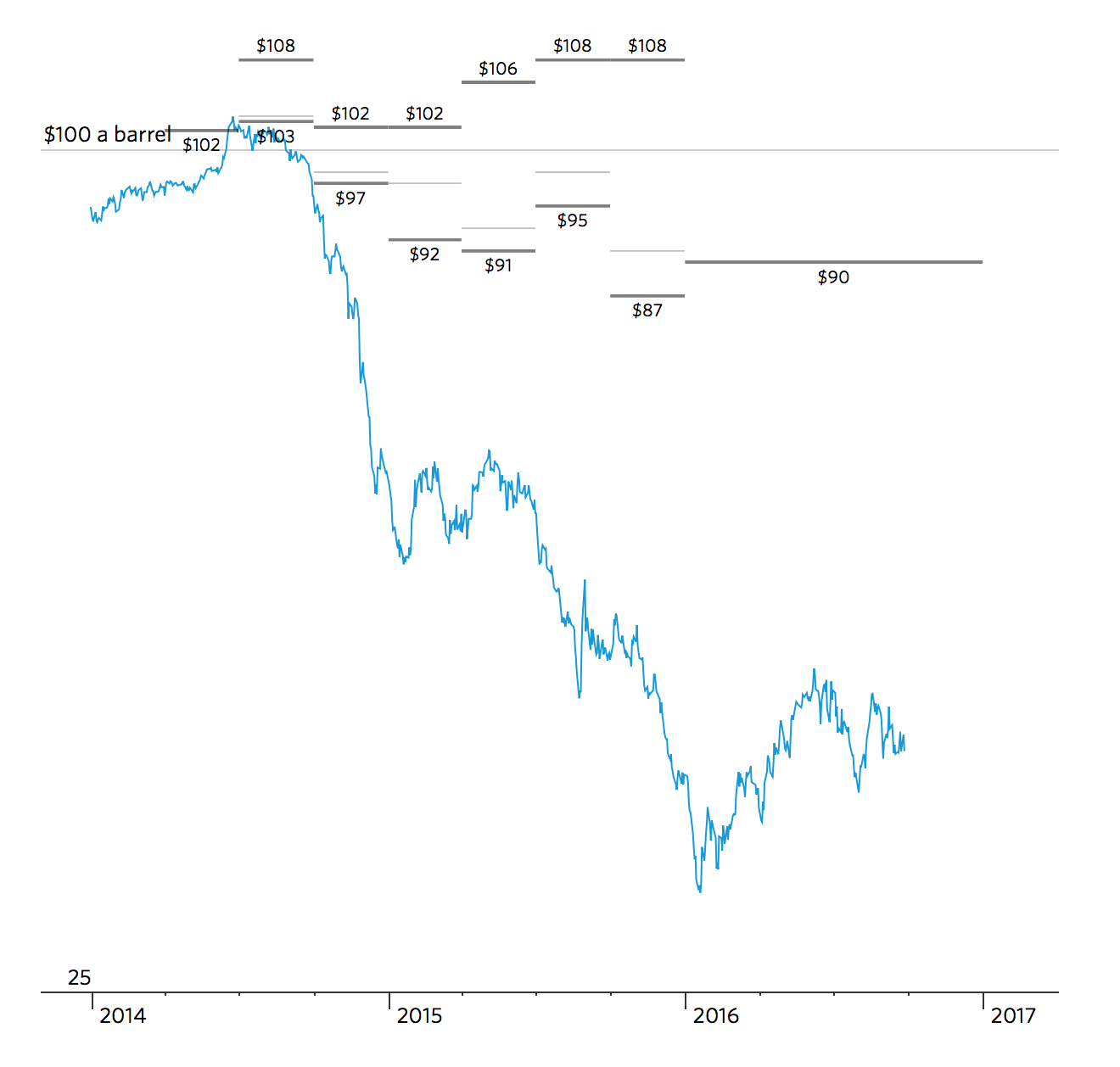
My first sketches, made using D3, were an attempt at recreating my colleague Pat Minczeski’s original static design.
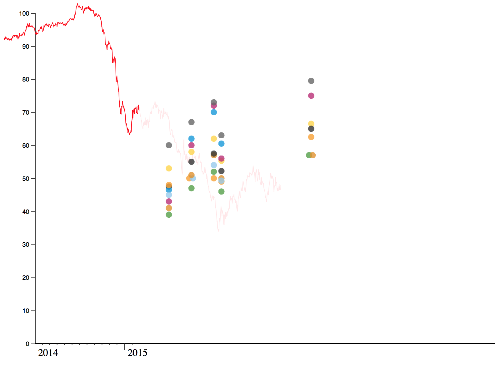
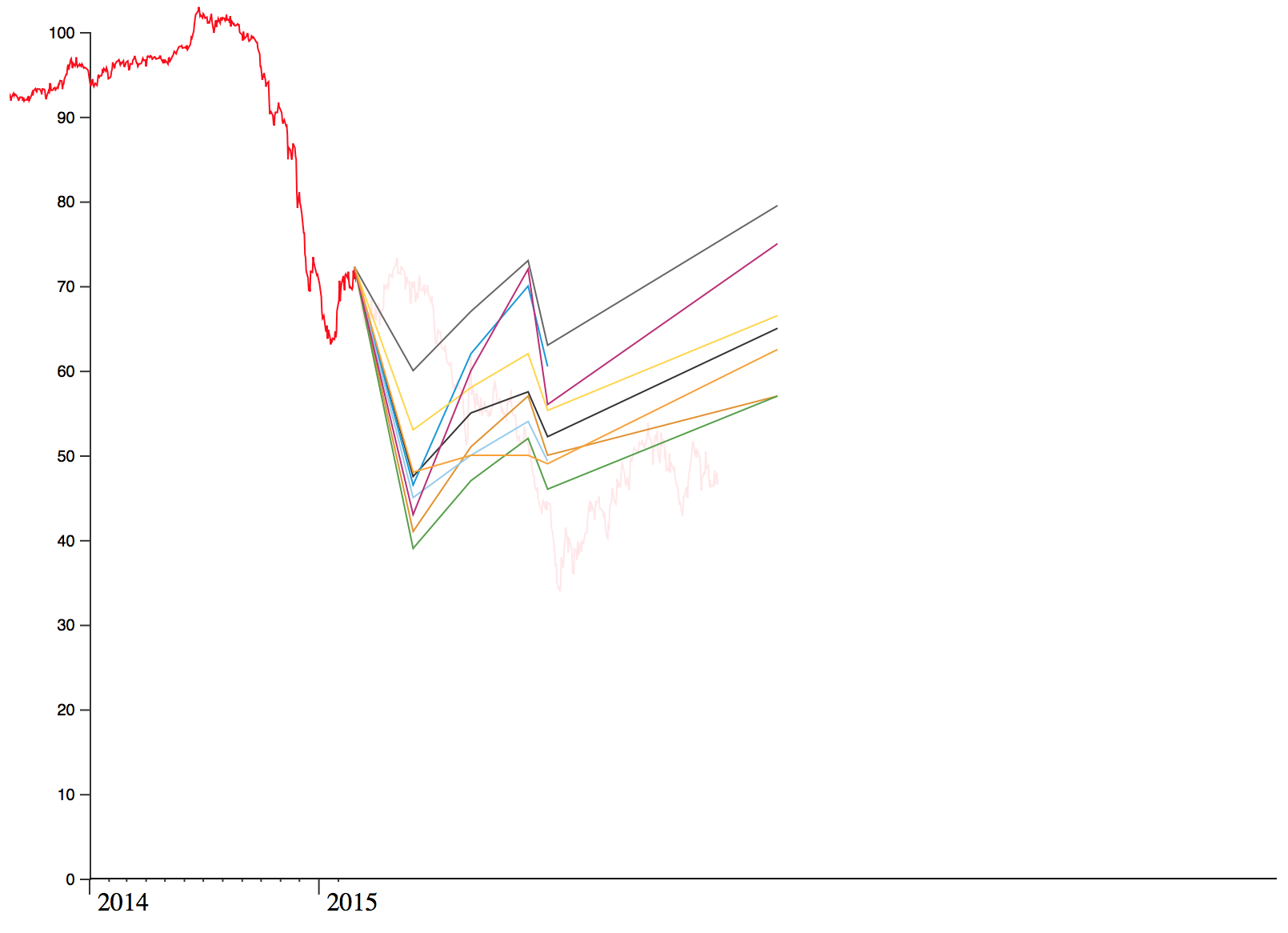
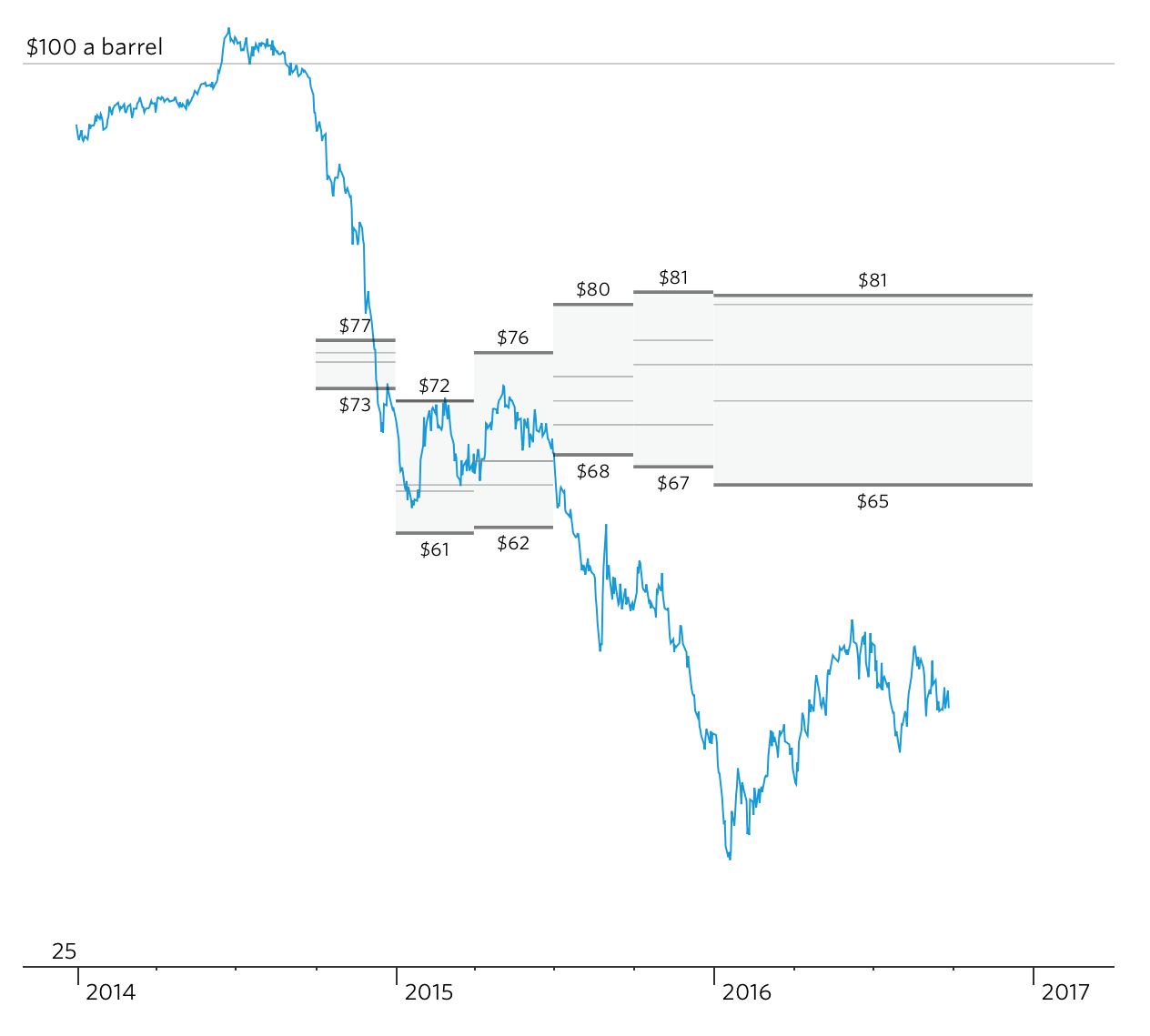
I then began to experiment with other ways of presenting the same data.
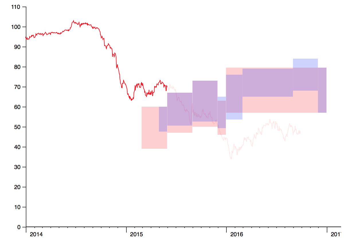
One idea was a ‘fan’ design, as used by Andrew Van Dam to chart Fed forecasts of the interest-rate target.
Early in the project, I was interested in displaying more than one forecast at one time. But even as fans, two became difficult to distinguish — and all at once was an unreadable mess.
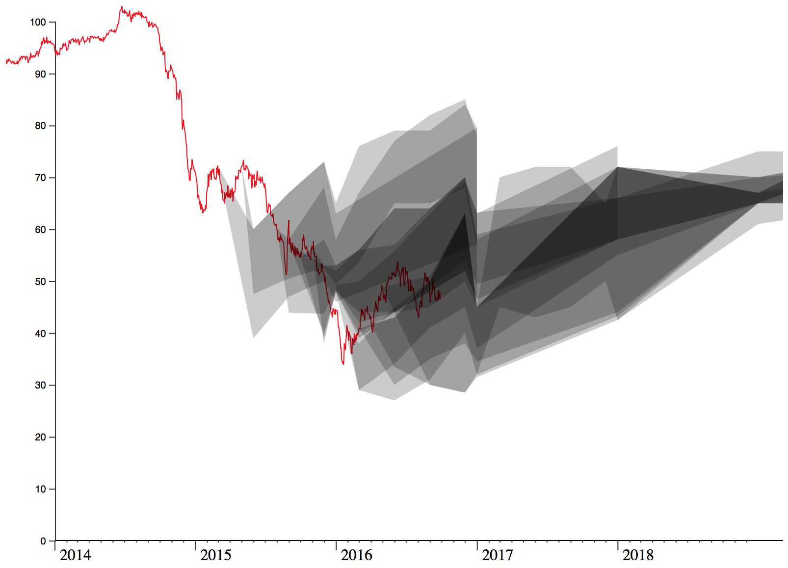
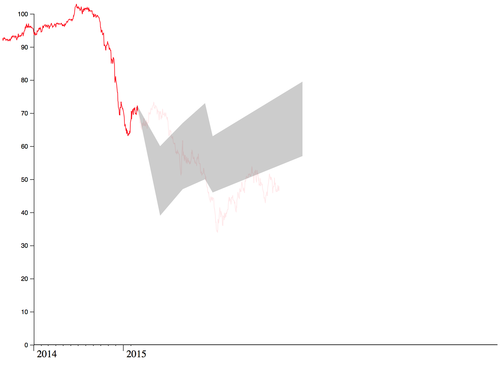
Rectangular fans didn’t help much, either.
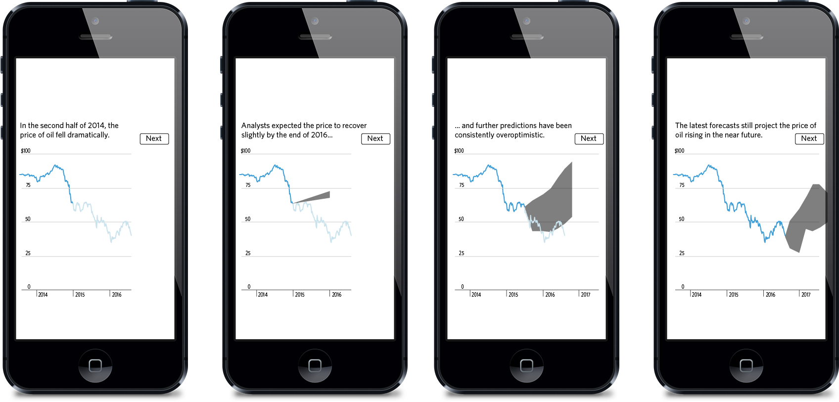
At the Wall Street Journal, we’re now beginning to favour narrative-based graphics which lead the reader through the data, as opposed to traditional ‘tools’ and ‘dashboards’, which (though useful) task the reader with finding interesting patterns on their own. My original designs used a ‘stepper’ design, but I was quickly convinced by others on the graphics team to adopt a scroll-based system instead, inspired in particular by this Bloomberg graphic.
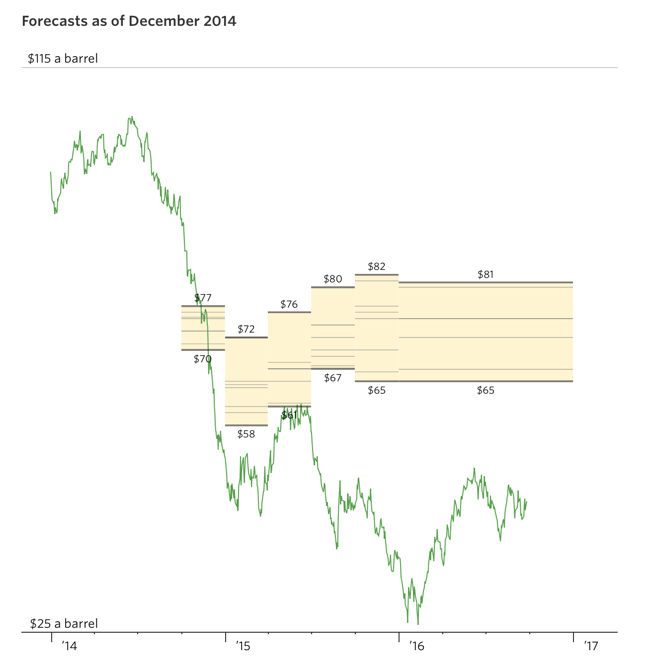
We settled on representing the forecasts as horizontal lines, so that they became yardsticks by which to measure the actual price of oil.
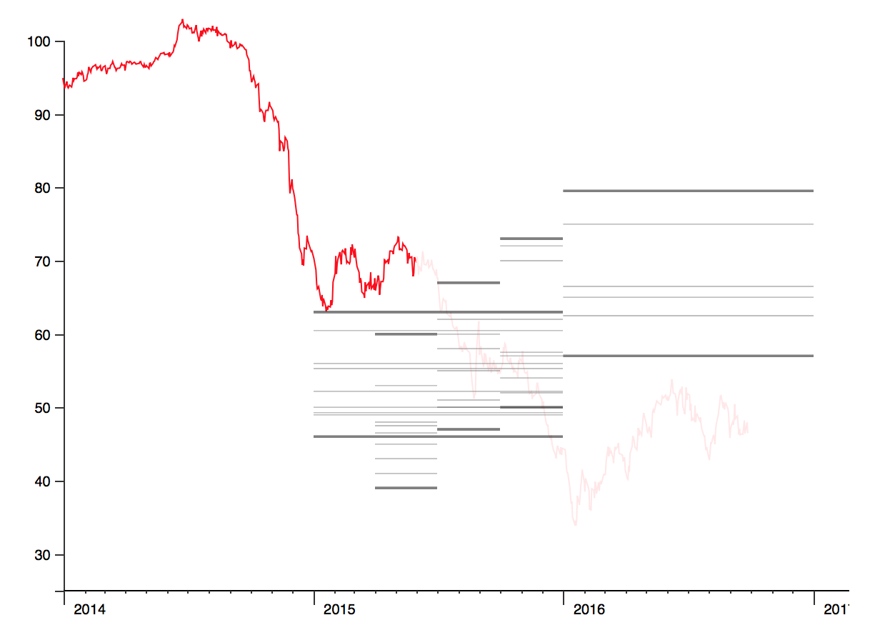
The standard Y-axis was replaced with a minimal version to prevent visual conflict with the forecasts.
They later gained a background fill, which had the additional bonus of providing a clear hover target for tooltips.
The final design includes a different colour scheme and small improvements to the axes.
If you have a WSJ subscription, you can view the completed graphic here. If you don’t have a subscription… why not? 😜
Published .