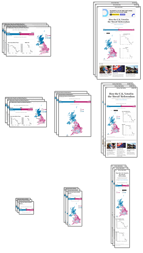
I’ve now been involved in the development of several live result graphics: the 2014 Scottish referendum, two Greek elections (January/September) and the 2015 UK general election. Each time I get a little bit better at the hair-raising task of coding a graphic without knowing the final shape of the data.
For the Brexit referendum just gone, I tried to follow my own advice from last year by doing the following:
- Starting development of the server-side data-fetching/processing code before anything else, and working out its hosting infrastructure relatively early on. Despite this preparation, there was still a last-minute change to hosting of the results data file.
- Using momentjs for handling parsing and rendering of dates, thus skirting any potential timezone issues. Thankfully there were no issues this time round.
- Writing the code as a series of completely isolated modules (more on this below). This was certainly true of the JavaScript bits, but the CSS — especially the grid-layout homepage widget — was somewhat trickier to modify on-the-fly.
But overall it was a success (thanks to help from my colleagues Chris Canipe, Palani Kumanan, Jessia Ma, Renee Rigdon and Stuart Thompson, with auxiliary support from many more) and I came away from this latest project with a few more techniques — which I plan to apply to many more interactive graphics.
Divide and conquer
After last year’s painful last-minute refactor, I made sure to plan out the structure of this graphic’s code before writing any of it. Having spent some time with requirejs and ES6 modules over the last twelve months, I decided to take a similar approach (albeit without a module-loading system).
The modules for this project were as follows:
- Data fetcher for live results
- Data fetcher for live markets data
- ‘Results bar’ (the big bar at the top)
- Results map
- Line chart
- Collection of line charts
There was also a small ‘controller’ script which tied these all together: fetching data, passing them to the relevant module, and handling things like window resize and automatic updates every two minutes.
Some modules, such as the charts and map, followed the object-oriented constructor pattern I’ve written about previously.
// create new map
var map = new ResultsMap({
  element: $(".map-container")[0],
  view: "areas",
});

// load in geojson asynchronously
$.getJSON("data/brexit_382.geo.json", function (uk) {
  map.setGeo(uk);
});
Others worked just as a plain function. When the ‘Results Bar’ was passed a new set of data, it would simply run the entire process again and overwrite the existing markup.
// after an ajax call for the data
setResultsBar({
  element: $(".results-container")[0],
  data: data,
});
Similarly, the data-fetching modules (which were all contained in an object called getData) would return JavaScript promises (specifically, jQuery deferred objects for the controller script to resolve.1
getData.results().then(function (d) {
map.setData(d);
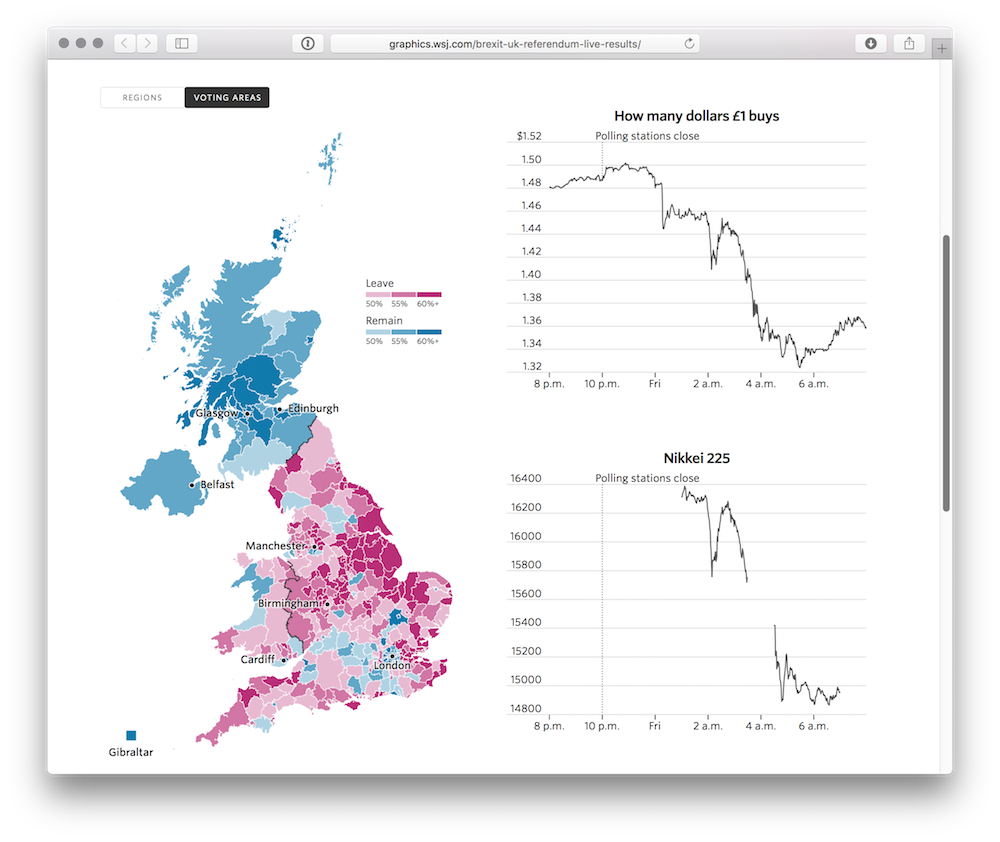
});This modular structure allowed us to build and test each part of the graphic in isolation before slotting them together later on. For example, the map was developed separately by Chris Canipe in the US and added to the graphic with near-zero modification to the rest of the code.
Here’s a diagram representing how the same modules are used in both test files and the full graphic. They are, in effect, miniature JavaScript libraries.
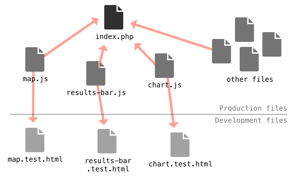
The files with “test” in their names are bare-bones HTML files which include the minimum JavaScript and CSS needed to get the module to work. They provide a clean environment for developing and testing each module separately. For structure and lightweight unit tests, I often add QUnit to each test page.
A better way of processing data
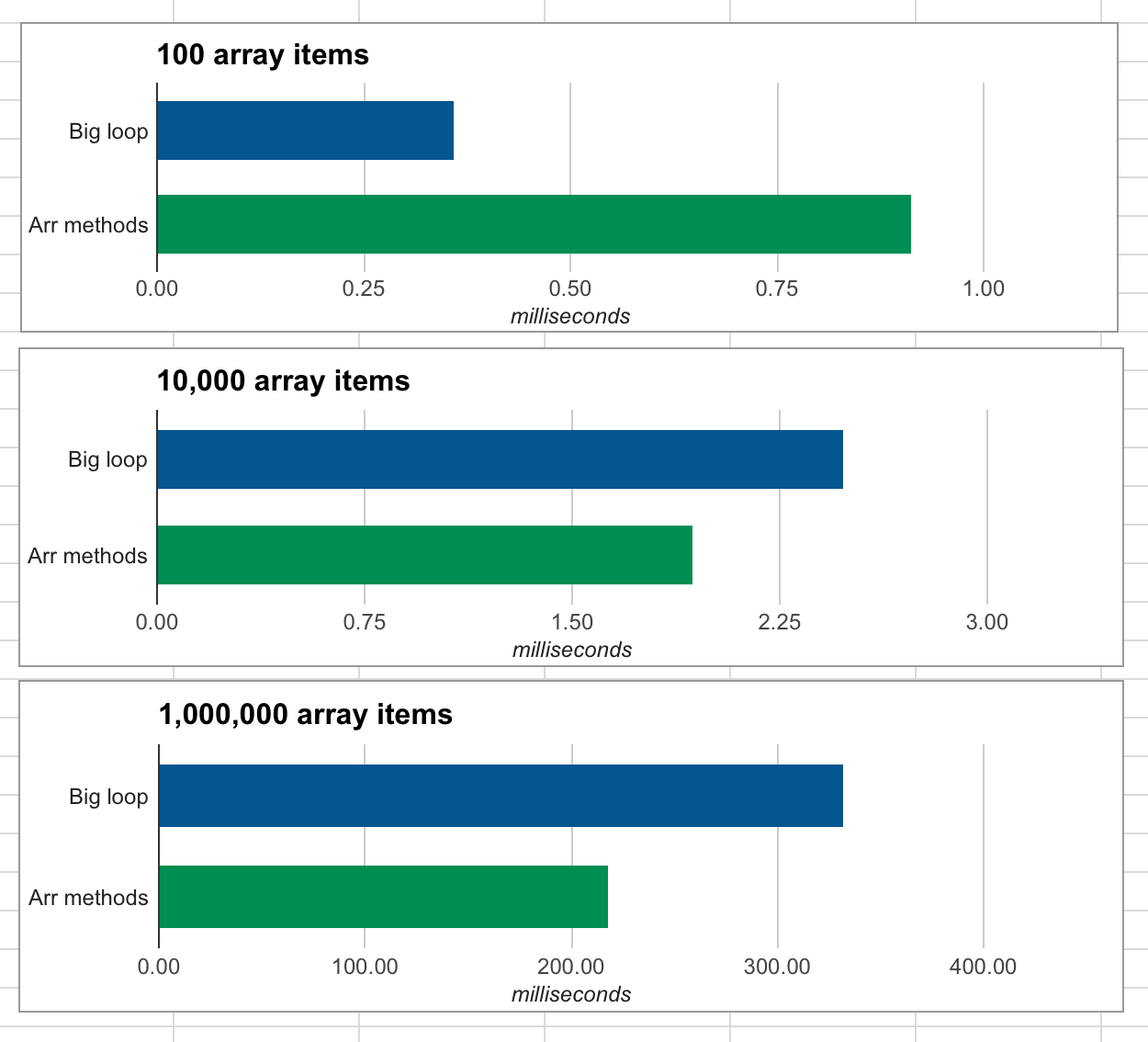
Live data calls for battle-hardened processing scripts, both on the server and client. Traditionally, I’ve used a series of big loops to do this; but more recently, I’ve been learning a functional approach using JavaScript’s array methods.
What do I mean by array methods? Well, you may already be familiar with forEach, a modern method for looping through arrays. It’s complemented by a number of additional methods, including filter, map and reduce.
Using these four in conjunction can result in far more readable code — at least in comparison to the mega-loops I used to write. For example, take a look at this code:
var seats = 0;
var processed = [];
var filtered = [];
for (var i = 0; i < data.length; i++) {
  var d = data[i];
  d.seatsPc = (d.seats / 320) * 100;
  processed.push(d);
  seats += d.seats;
  if (d.visible === true) {
    filtered.push(d);
  }
}
This loop does many things in one go:
- Calculate percentages for each item (for a new
processedarray) - Count total seats
- Create new
filteredarray
Efficient, perhaps — but it’s difficult to read because it mixes functionality. Here’s the same thing rewritten with array methods.
// calculate percentages for each item
var processed = data.map(function (d, i) {
  d.seatsPc = (d.seats / 320) * 100;
  return d;
});

// count total seats
var seats = data.reduce(function (prev, curr) {
  return prev + curr.seats;
});

// create new filtered array
var filtered = processed.filter(function (d, i) {
  return d.visible;
});
Admittedly, these new array methods are slightly difficult to get one’s head around (a good overview here). Once mastered, though, they make a huge difference. Plus, performance and browser support are both great.2
If you’re in a position to use next-generation “ES6” JavaScript (perhaps in a Node script), the new “fat arrow function” syntax makes the above code even more concise:
// calculate percentages for each item
const processed = data.map((d) => {
  d.seatsPc = (d.seats / 320) * 100;
  return d;
});

// count total seats
const seats = data.reduce((prev, curr) => prev + curr.seats);

// create new filtered array
const filtered = processed.filter((d) => d.visible);
Crazy, right? ES6 is a whole new world.
Exploring infinite worlds
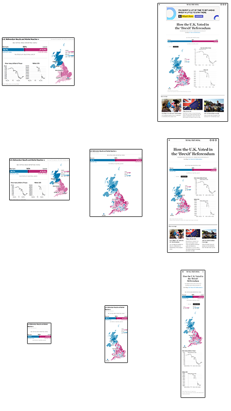
There are three different ways in which this graphic might be viewed: on the homepage, within an article, or as a standalone page. Each requires a slightly different design.
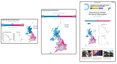
But then each of these may appear on screens of different widths…
Not to mention that the live data will change the state of the graphic through the night: from blank and awaiting results, through to 100% reported.
So that’s three dimensions so far. What else? Well, there are a range of different browsers to test the design on. Old versions of Internet explorer tend to be particularly bothersome. Then there’s the question of touchscreens — which now are not only in mobile devices, but in full-sized desktop computers too. And so on. All of these scenarios, multiplied, results in a multidimensional matrix of possibilities.3
How on earth can one test all of these permutations, especially on a deadline? I don’t have a good answer yet. So far I’ve relied on a handful of unit tests, frequent spot checks, and handy URL parameters for quick switching of test data. If anyone has a more thorough or practical method to deal with this problem, I’d be very interested to hear it.
Thanks to Palani Kumanan and Jessia Ma for providing feedback on a draft of this post.
Footnotes
-
My colleague Palani Kumanan tells me that the “pub-sub” pattern would work well here. I’m not yet familiar with it, but it’s something I intend to learn more about in the near future. ↩
-
You might expect these additional loops to impact performance, but in a simple test I found array methods to actually provide better performance than a big loop (except for when arrays are short, in which case the difference is trivial). See the chart below, in which shorter bars are better.
Browser support for these is extensive, assuming you’re no longer supporting IE9 or below. ↩
-
This idea is admittedly a bit nuts, but it’s inspired by a concept in ecology called the Hutchinsonian niche:
↩The Hutchinsonian niche is an n-dimensional hypervolume, where the dimensions are environmental conditions and resources, that define the requirements of an individual or a species to practice “its” way of life, more particularly, for its population to persist. The “hypervolume” defines the multi-dimensional space of resources (e.g., light, nutrients, structure, etc.) available to (and specifically used by) organisms, and “all species other than those under consideration are regarded as part of the coordinate system.”
Published .