It’s a tough time for interactives. Last year saw debates around whether the format is dead (or not) and it’s difficult not to notice an industry-wide trend away from interactive graphics using live code and towards static images and ai2html.
There are many good reasons for this: better understanding of reader behaviour, a move away from confusing unstructured and nonlinear structures to linear ones, design limitations imposed by mobile devices, third-party platforms for redistributing articles — such as Google AMP or Facebook Instant Articles — that don’t support custom scripting and complex content, and (perhaps above all) an acknowledgement that interactivity for interactivity’s sake is not worth the effort.
This sea change can be depressing. I entered the world of graphics as a web developer-reporter hybrid, so to see the “web dev” side becoming less important sometimes leaves me feeling like a relic, as if I’m hanging on to an outdated format and a decreasingly relevant skillset.
So to counter that feeling, here are some of the things that interactive graphics (or to use my preferred term, web graphics, since some of these don’t strictly involve interactivity) can do that traditional articles or static images can’t. I compiled this list, adapted from a talk I gave in 2015, as a source of inspiration for my own work, and I hope it inspires you too.
Explore huge datasets
A classic use of interactivity is to present the reader with a huge dataset and allow them to ‘dive in’ and explore in as much depth as they like. Sometimes this takes the shape of a giant table (below); other times, a big interactive map.
This format is often looked down upon nowadays, since it expects the reader to find the interesting bits themselves; but it can still be valuable if the data are juicy enough. I find that the most successful versions accept the fact they are simply tools (as opposed to being articles), such as the extremely popular WSJ College Rankings.
Guide a reader through complex charts
A now common format begins with a single chart and then proceeds to manipulate it — zooming in and out, travelling through time, switching out data — in order to fully explore the dataset. This pairs exceptionally well with scrollytelling and is especially valuable on mobile, where there may not be enough space to show all elements of a chart at once.
In the now classic piece ‘A visual introduction to machine learning’1 (above), the same data points transition between multiple chart formats, helping readers keep track of how the machine learning algorithms are sorting them. Another good example is ‘100 years of tax brackets, in one chart’, a Vox piece that zooms in and out of a dataset that might be overwhelming if presented otherwise.
Incorporate live data
Why settle for a static dataset when you can use the latest numbers of whatever you’re charting? Elections, sport coverage, weather events and financial data are obvious sources of live data interesting enough to display in real time. Even more cool is providing context for these live figures in interesting ways — for example, showing which countries benefit from the current price of oil (below).

Ampp3d, a short-lived experimental pop-data journalism outlet, used live counters to bring numbers to life in interesting ways, such as the number of immigrants entering the UK, and footballer Wayne Rooney’s earnings. Sadly, these have since been taken offline.
Place the reader within the data
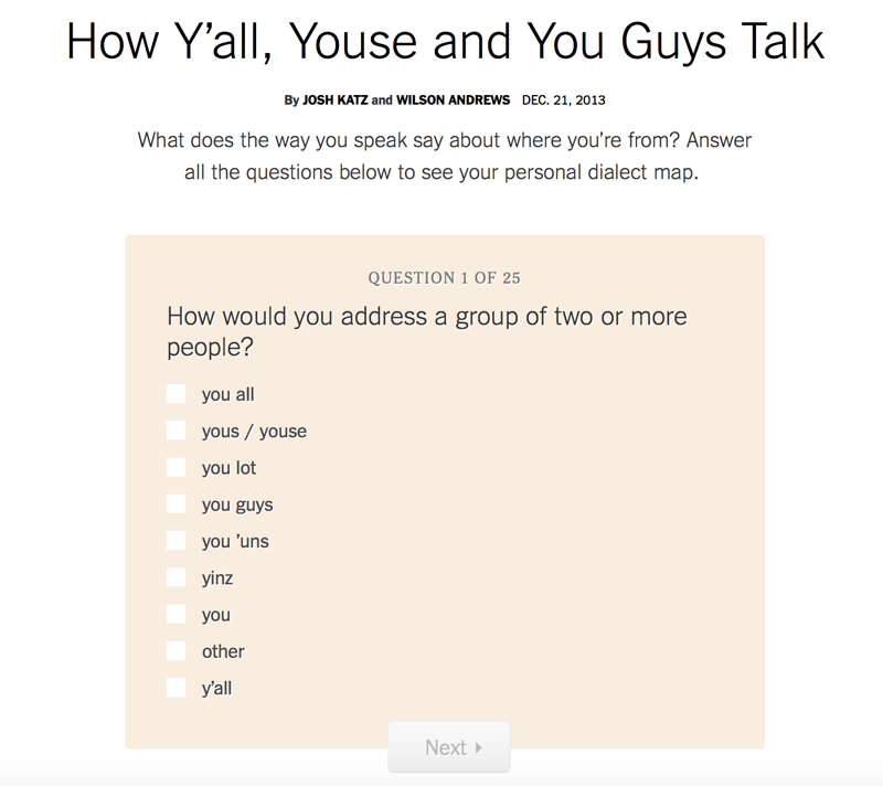
Another twist on the ‘huge datasets’ idea — and one that I’ve found to be incredibly compelling to readers — is to show the reader where they fall in a dataset, usually by asking for a couple of personal details. The New York Times’ 2013 dialect quiz map (below) famously became the publication’s most popular article of the year — despite only being published on December 20th.
The BBC seem to do these pretty frequently, often as a public service tool, with things like “UK fat scale calculator”. I like this Quartz piece on how people in different cultures draw circles, which opens by asking the reader to draw a circle, a compelling introduction to an otherwise (potentially) dull feature.
Create original datasets
A step beyond the previous category are projects that not only use readers’ submitted data to give an immediate response, but also to compile a new dataset for further analysis.
The Australian Broadcasting Corporation collaborated with political scientists on a ‘Vote Compass’ to help readers understand their place in the political landscape — and then wrote a series of articles based on the data.
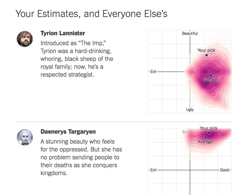
More recently, the NYT used the same idea on a softer subject, asking readers to rate Game of Thrones characters and plotting the results on live charts (above).
Infinite canvas
I borrowed this term from artist Scott McCloud, who argues that there is “no reason that longform comics have to be split into pages when moving online”. And indeed, why should our graphics be constrained to the limits of paper either?
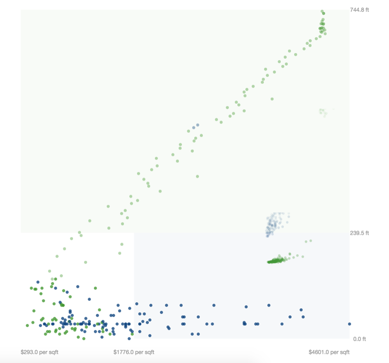
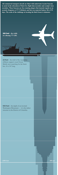
In the Washington Post’s ‘The depth of the problem’, a 16K-pixel tall graphic is used to show the depth of the ocean area being searched for missing flight MH370 (extract below). Sure, this information could have been squeezed into a single screen, but it would have lacked the level of detail and emotional impact of this extremely tall graphic.
It’s a great format for maps, too, such as NYT’s ‘A Rogue State Along Two Rivers’. BuzzFeed’s weird, Brutalist, mega-tall chart ‘This Is What 29 Million Cars Looks Like’ also still holds a special place in my heart.
Art-directed longform stories
The NYT’s Snowfall (below) is the OG of this format — long stories livened up with arresting design, big photos and illustrations, and little interactive bits. My favourite is still Bloomberg’s ‘What Is Code?’, one of the few examples in this genre that I actually read through to the end.

These pieces seem less common now, perhaps since they’ve lost the power to impress, or perhaps because the spectacle is lessened on mobile devices. However, their legacy lives on in some publications’ standard article pages, which more frequently use full-bleed photos and dynamic layouts.
Challenge the reader with a simple game
On the opposite end of the spectrum from longform stories are ‘newsgames’, interactive experiences that borrow mechanics from video games to explore news subjects and follow a philosophy of ‘show, don’t tell’. Quizzes come under this category too, I guess.
I had a go at a newsgame of my own last year with ‘Build Your Own Trading Bot’, in which I attempted to explain algorithmic trading by allowing readers to try their hand at it in a safe environment.
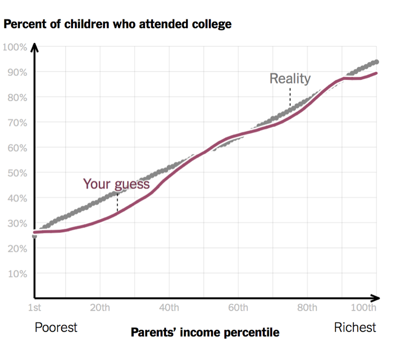
Another example would be the Upshot’s ‘You Draw It’ series (above) which challenges readers’ assumptions by asking them to fill in a blank chart, before revealing the answer and exploring the subject in greater depth. Some ask the reader to solve a simplified version of a real-world problem — such as how to fund the BBC — to prove just how difficult it is.
Sure, these could be considered toys, presenting the reader with only surface-level information, but done right they can provide a fresh perspective on played-out subjects. UsVsTh3m (sister site of Ampp3d, and also long dead) published an incredible game called ‘Where’s Damascus (Don’t Ask Us)’ which asked the reader to identify the capital of Syria on an unmarked world map. It’s a masterstroke of political commentary, challenging readers’ belief in their own knowledge of current affairs.
Or provoke thought with a serious game
Sometimes interactives go beyond just borrowing videogame mechanics, and try to explain a subject through a fully-fledged videogame. Two recent examples are the FT’s Uber Game (below) and Bloomberg’s ‘American Mall’, simulating the business operations of an Uber driver and American shopping malls. Both draw heavily on original research and reporting.

I also love Nicky Case’s ‘Explorable Explanations’ (my favourite being ‘We Become What We Behold’), which explain complex subject matter through games based on interlinking systems.
Game development is hard — both in terms of technical ability needed, and getting editors and reporters on board with a radical idea. I once attended a talk by the developers of the BBC’s ‘Syrian Journey: Choose your own escape route’, who flat-out refused to call it a ‘game’ because the term was so loaded (although that didn’t prevent criticism of the format).
Perform live experiments
A related format is to allow the reader to run a live simulation in their browser. More than just an animated explainer, this introduces a degree of randomness that leads to a unique result each time and is a great way to bring abstract statistical probabilities to life.

The above Guardian piece simulates a measles outbreak across ten populations with varying rates of vaccination. The web graphics make the results starkly clear in a way that percentages alone could not convey. In Nathan Yau’s ‘Years You Have Left to Live, Probably’, a simple line chart (“probability of living to next year”) is made more poignant with ‘lives’ that die at random and then pile up.
These simulations don’t have to use imaginary data. ‘The Birthday Paradox’ uses data from previous visitors to the page to test the probability of shared birthdays.
Immerse with 3D, VR and AR
Modern graphics technologies such as WebGL allow us to immerse readers in 3D landscapes, whether inspired by real locations, or generated from abstract data.

In 2015, the WSJ made waves with its 3D Nasdaq Rollercoaster (above) which took the reader on the literal ups and downs of the stock market. We’re still using 3D at WSJ, although in more restrained ways, such as in Cassini’s Last Dance with Saturn.
Augmented reality, in which images from the reader’s camera are overlaid with graphics and annotations, is the hot new thing right now, although I’ve yet to see it used in a way beyond plonking a 3D model in front of the reader.
Use sound to stimulate an additional sense
Audio can elevate an experience to being truly delightful or powerful. How about having a writer ‘call’ you to comment on modern phone call etiquette? Or exploring international football culture using clips of commentators screaming ‘GOOOOOOOAL’? Or hearing police officers frantically searching for an active shooter? Each of these could easily have been a video, but as web pages, can take advantage of an entire page and allow readers control of playback.
Let your imagination run wild
The promise and potential of interactives can sometimes feel played out, with so much ground already covered and the move towards static formats. Yet journalist-developers across the industry continue to prove there are ways in which we can tell stories on the web using more than just words and images. When we use the unique strengths of the medium, our work can be far more effective than any traditional article.
Thank you to Amelia Bellamy-Royds, Alex Selby-Boothroyd and Eileen Clancy for their feedback on a draft of this post.
Footnotes
-
It’s been three years but I’m still holding out for part two! ↩
Published .